Our CEO Mat Herman sits down with designer Kyle Schuneman to hear how a designer actually designs his own space.
If you’ve been following Apt2B at all then you know the name Kyle Schuneman. Kyle is an interior designer who’s best known for his trademark work in the small-space design world. He’s worked closely with Apt2B throughout the years designing his own exclusive line of Apt2B upholstery and providing our customers with tons of clever design tips and tricks. Fortunately for me, Kyle doesn’t just work with me at Apt2B – he’s also is my design spirit animal. Kyle and I have become close friends over the last five years of working together, and it’s always nice to have a rockstar interior designer as a friend! So when he offered me a figurative look behind the curtains at his brand new Chicago home I was ecstatic. What I saw absolutely blew me away. It also left me with a ton of questions I wanted to ask him about his design decisions. Thankfully I got a chance to sit down with him and ask him what it was like to design an apartment for his most difficult client yet – himself.
Chicago vs. LA
Mat: Kyle, when you told me that you made an offer on your first home this past summer I was so excited for you… except for the part when you told me it was in Chicago and not in L.A.. I know you’re originally from Chicago, but why did you choose Chicago over L.A. for your first home purchase?
Kyle: I’ve always wanted to own a place in Chicago. It’s always felt like home. And after saving up for a while I was ready to buy somewhere. But when looking in Los Angeles – where I mostly work – I realized how expensive it was and how you can’t get much for your money. So that’s why I decided to go back to Chicago. Also, having a home base there now helps me work in both LA and Chicago. I love being right in the heart of the city that I grew up in.
Bye Bye Baby
Mat: When you showed me the original listing of your new home in Chicago, I remember that the previous owners used the second bedroom as a nursery. Was that challenging for you to envision what you would do with that second bedroom? And what did you do with that room?
Kyle: Not at all. I mean, that’s what I do for clients all the time – re-envision spaces for their needs. So I don’t really have that problem of not seeing the potential of the space. I knew I always wanted a den that could also double as a guest room.
They’ve Gone Plaid!
Mat: I know you’re OBSESSED with plaid. Can you tell us a little more about where your love for plaid came from and how you incorporated it into your home?
Kyle: Growing up, my mom always decked out the house for Christmas. And that meant a lot of plaid. For me it was – and still is – the most magical time of the year. So I really relate plaid to that magic and also that tradition. I love that the fabrics have been around forever and that they tell stories depending on their color combination and design. To me it is such a design staple. I love that it is always classic and it’s really how you incorporate it that it can change a room.

Ego Trip?
Mat: So what’s it like for your ego to actually sit and use furniture that you designed for Apt2B and sleep in bedding that has your name on it too?
Kyle: Haha! Well first I give myself 2 thumbs up in a mirror before sitting or sleeping on anything I’ve designed. Kidding. It actually feels more like a full circle moment more than anything else. It’s definitely super cool but I also love really living with the pieces – it gives me insight for future design and to make these pieces as both practical and beautiful as possible.
Mat: Were you the only decision maker in the design and decor pieces in your home?
Kyle: I bought the loft with my fiancé. Luckily he defers to me on all design related choices SO it works out perfectly haha!
 Deck The Walls
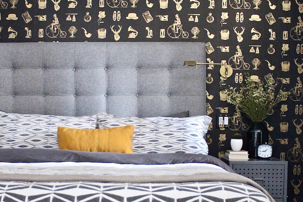
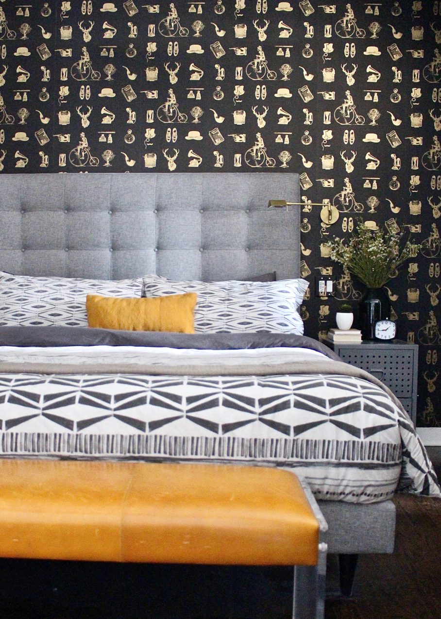
Mat: The Wallpaper!!! OMG. Personally, I love wallpaper and have been cheering for its comeback for years. Clearly it’s officially back based on the fact that you covered many of your walls with these beautifully-chosen prints. How hard was it to commit to wallpaper since it’s pretty much a permanent decision?
Kyle: I think design shouldn’t be half-assed. I don’t like thinking in terms of temporary – sure things can be taken down or replaced but I think if you love it you go for it. And because this was my first place I was ready to make some bold choices! No clients to tell me, “no,” and no landlords to tell me, “I can’t” – it felt liberating.
Color Me Surprised
Mat: With Apt2B, bold color has always been a signature footprint of your collections with us. How did you use pops of colors in your own home?
Kyle: For this specific loft – being built in the early 1900s – I wanted to have a pretty classic black, white, and grey backdrop that had an industrial edge. But I, of course, love color. So what’s great about that backdrop is that with throw pillows, blankets, accessories, and bedding I can have lots of pops of colors that can change seasonally or annually. It’s also great for the different holidays cause it can really change based on the holiday.
Mat: You refer to your design style a lot as leaning toward a masculine aesthetic. Can you explain more to us what that means to you?
Kyle: I naturally just tend toward a masculine aesthetic. It means clean lines, straight edges, natural materials and warmer colors. Another term I like to use is “handsome”. I think it makes people realize it’s a broader style than just for guys.
Collect Yourself
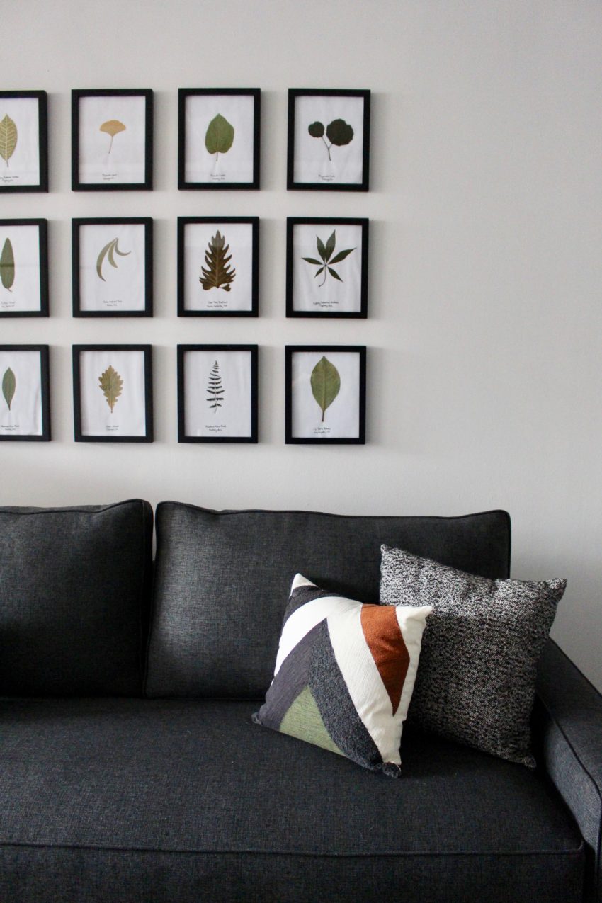 Mat: A lot of interesting people seem to collect something. Do you have a collection?
Kyle: Yes! My fiancé and I collect a leaf from every place we travel. I press them in a book while I’m traveling and then frame them on the wall. I use a really basic black frame with a white matte and at the bottom I handwrite where we collected it. It’s created a memory wall in our den of our trips around the world. And it’s such an easy collection to keep going. It’s my favorite part of the house because it’s so personal.
Mat: That’s pretty adorable, I actually collect baseball cards and sports memorabilia. I’ve been doing it since I was a kid, but all the stuff sits in a boxes in my closet, which drives me crazy. How do you display your collection/leaves?
Kyle: I think the simpler the better for displaying of collections. It makes the actual objects pop more. Not to mention, as you’re expanding it’s easy to add to – if you do something ornate and can’t find that shelf or frame you’re stuck!
Mat: Is there one WOW piece in your home? And if so what is it?
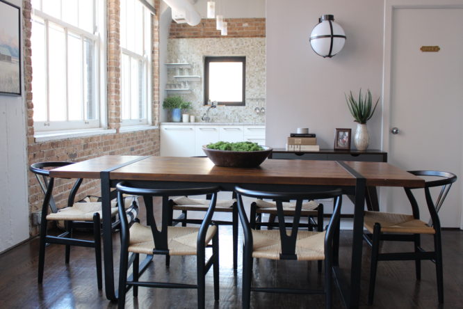
Kyle: I actually think it’s the dining set. Everyone comments on it. The chairs are so sculptural and then the interesting table with the wood and metal together really make it super cool. Since it’s just floating in this big room it needed to be significant to stand on its own.
- Mineola Side Chair BLACK
- Williamsburg Dining Table
Tips of the Trade
Mat: Where did you learn your trade? I never actually asked you that before. Did you go to school? Study under a famous designer? Or was it just instinctual for you?
Kyle: A little of everything. I started subscribing to Architectural Digest at 13 so I always loved it. And Chicago is such a powerhouse in architecture. I thought that’s what I wanted to do until I found out how long it took to study! And I realized that what I loved was the interiors more than the actual construction. Someone mentioned designing sets as being able to create spaces without them being actual buildings. So I moved to LA and started working under a designer for a couple of years and it built from that.
Mat: You always hear about design “do’s and don’ts.” Do you have any hard rules when working with clients? And did you break any rules while designing your own space?
Kyle: I hate rules. I never think anything works in all settings so it’s hard if you’re not talking about a specific room. I’m sure a lot of clients would have given me pushback on using three completely different patterns of wallpaper in this space. But each one really gave an anchor backdrop to the space – and lofts sometimes need that anchor. I also think I could be a little less practical with not having window treatments, for instance, because I loved the windows. I’m someone who likes to live a certain way who really is aesthetically-driven. And sometimes those things that clients will say is mandatory ruins the look. But I didn’t have to deal with that.
The Final Verdict
Mat: On a scale of 1-10, how much of a pain were you as your own client?
Kyle: I was SO easy because I was paying for it!
Mat: Do you make your bed every day?
Kyle: Absolutely. Getting into a messy bed at the end of the day is depressing. I could never do it.

Mat Herman (me) on the left and designer Kyle Schuneman on the right
